Unveiling the Most Amazing API Testing Tools of 2025
In the dynamic world of software development, APIs (Application Programming Interfaces) are the undisputed backbone, enabling seamless communication between diverse …
In the dynamic world of software development, APIs (Application Programming Interfaces) are the undisputed backbone, enabling seamless communication between diverse …

In the dynamic and exhilarating world of software engineering, efficiency, precision, and quality are not just buzzwords – they are …

Welcome to your ultimate guide to 8th grade ELA research project ideas—a carefully crafted collection of creative, engaging, and curriculum-aligned …
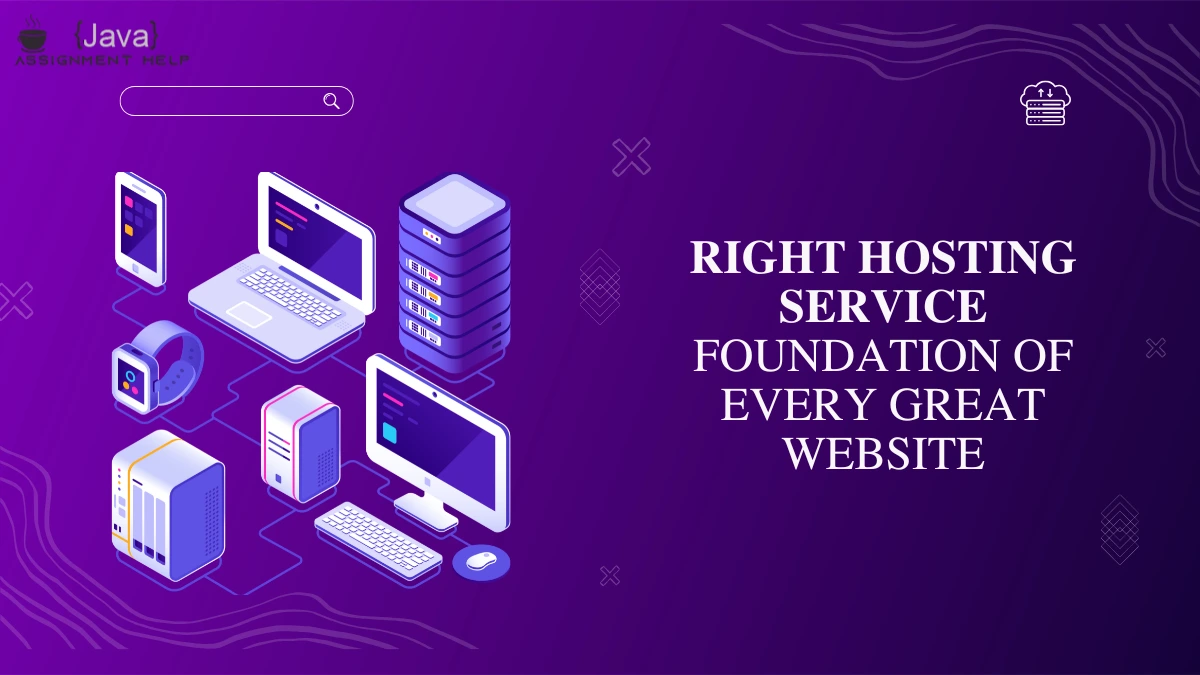
Creating a stunning, effective website takes more than just good design. Beneath the glossy visuals and engaging content lies something …

In today’s digital world, websites are the face of every business, and the people behind those websites are front-end web …

Java has earned its place as one of the most trusted and widely used programming languages in the tech world—and …

If you’re wondering how to start learning Java programming, you’re not alone. Java is one of the most popular and …

Have you ever wondered how to become a coder but felt confused about where to start? Perhaps you’ve come across …

If you’re learning Java or already building projects with it, you’ve probably wondered: Which is the best IDE for Java? …

Your website is often the first thing people see about your brand, so it needs to look good and work …